
Using Mise-en-scene

Before I begin my photoshoot(s), I want to research the different aspects that compose mise-en-scene. My research will help me put together the scene of my photoshoot.

For starters, mise-en-scene consists of everything that is captured in a shot. The different components all contribute in creating the aesthetic of the shot. The main characteristics are the setting, decorations, costume and/or makeup, lighting, and expressions.
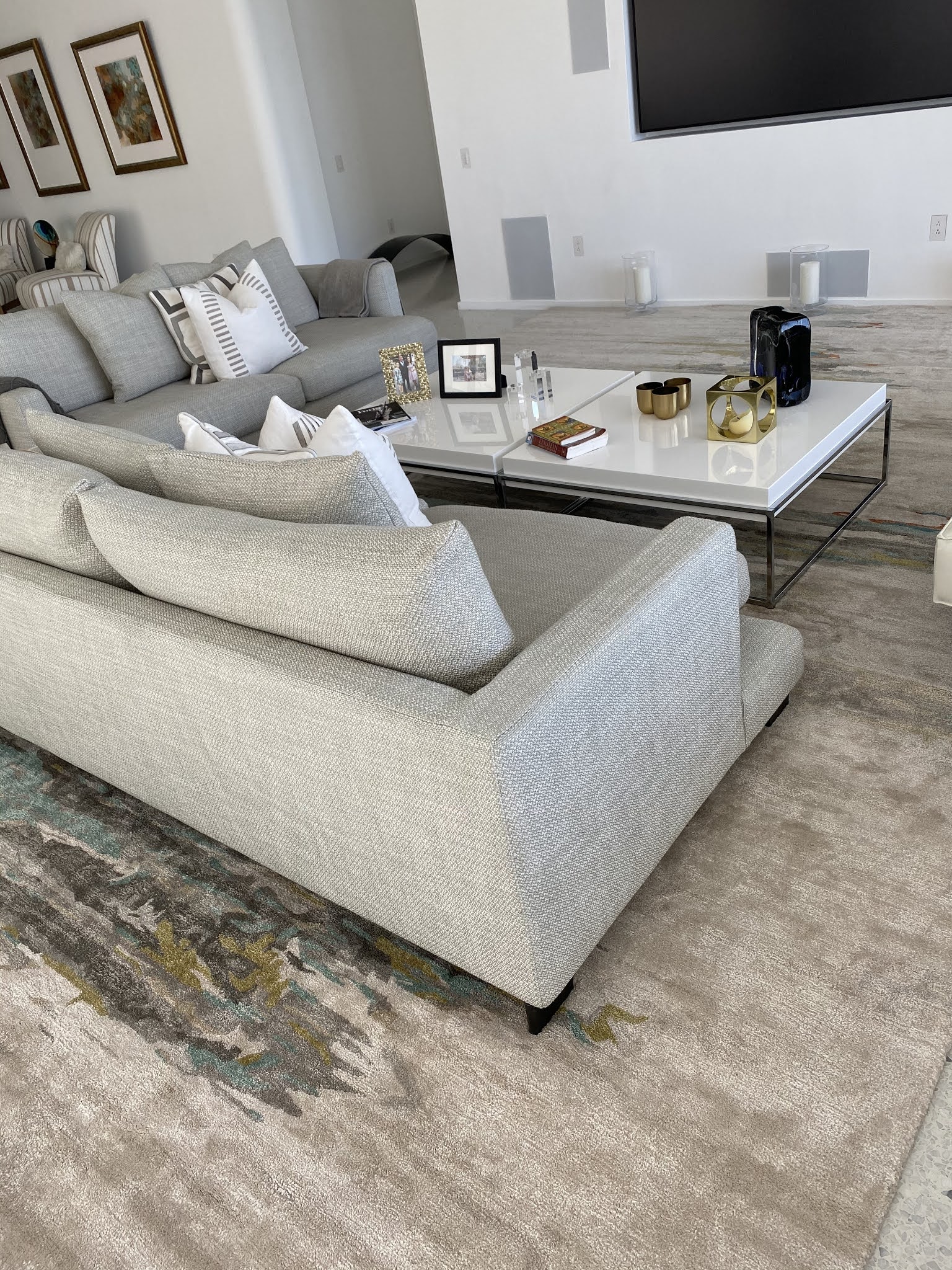
Setting

The setting is the place in which the photograph or film takes place. It can be a natural location or inside of a studio. The setting is important because it usually helps the audience have a better perception of what is occurring. The picture below is one of a natural scene. If this were the background of a photoshoot or a film, the audience would make some associations between the plot and the character. Sometimes settings are used for their aesthetic, while other times they have a larger significance.


Decorations

The decorations often have large significance in films, though this can also be the case in photographs. They are usually used more when photographs are taken in a studio, as opposed to a natural setting. In the picture below, the candles, picture frames, and books on the table are decorations that stand out. There are also two frames on the wall in the background as more decorations. 


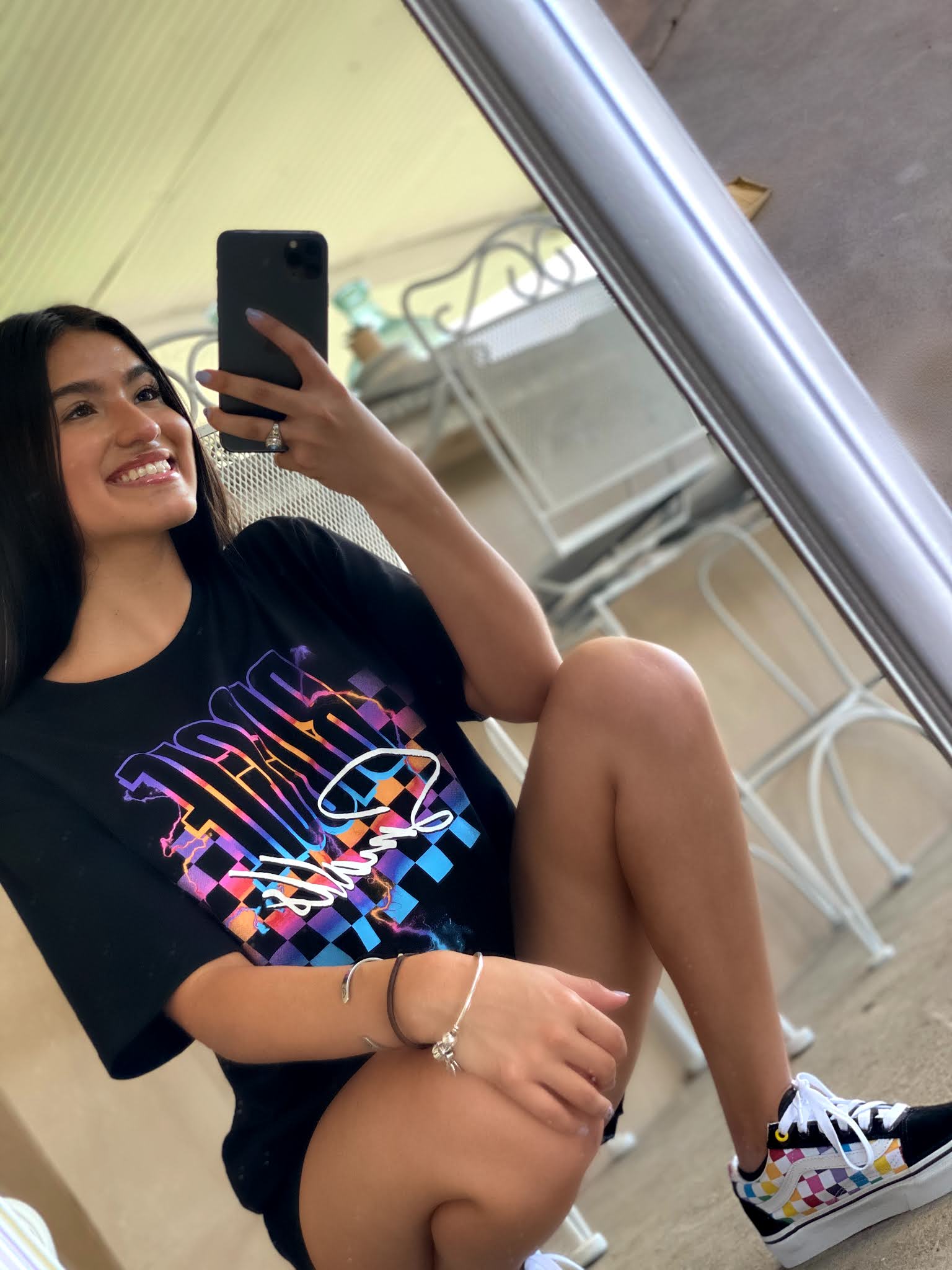
Costume and/or makeup

The costume consists of the model's attire, accessories, and makeup if they are wearing any. Many times jewelry is an attention-grabbing accessory in many magazine covers, while others are more simple. Models sometimes do not wear jewelry at all, so their costume is their clothing and shoes. The picture below is very minimalistic and simple. The accessories are two silver bracelets and a ring. The makeup look is also very minimal, as there is no flashy eyeshadow color standing out.


Lighting

The lighting consists of the illumination in the shot. Many times the lighting helps set the scene and mood for what is occurring. There can be bright lights illuminating the shots or there can be barely any lights at all to create a dimmer mood. The picture below was taken outdoors, so there is only natural light. It creates a bright scene. 


Expressions

Characters' facial expressions help convey their emotions to the audience. The expressions reveal more about the characters emotions at a certain moment and about their personality as well. In the picture below, the model is smiling. This helps the audience generalize that the person is in a happy mood.


Sources

https://www.dartmouth.edu/~film01/mise.html

https://www.lightsfilmschool.com/blog/mise-en-scene-in-film-afk


Comments

Popular posts from this blog

Evaluation Question 1: How does your product use or challenge conventions and how does it represent social groups or issues?

 Below is the link to my YouTube video: https://youtu.be/dDTCcIevXUc   Transcript Hello. My name is Kelly Lopez, and I will be answering compulsory question 1. The question is "How does your product use or challenge conventions and how does it represent social groups or issues?" Throughout my magazine I incorporated images such as the cover image on the cover page. I had mastheads, a barcode, subheadings, a tagline, an issue number, a date, columns, editor information, and even color schemes. I maintained the color scheme throughout the cover page, the contents page, and the double page spread. I kept my fonts the same for my cover page as opposed to using alternating ones throughout. I felt that this helped make my cover more aesthetically pleasing and more simplistic. I tried to ensure that any images featured were always the center of the attention in the design. In one way or another everything else on the page ensured that the readers stayed captivated and that they focu

Cover Page Draft Feedback

 I have drafted my magazine's cover page, and I am liking the overall look of it. I think I will be playing around with the font colors I use in order to improve its aesthetics and make it more visually appealing. Below are the two background photos I have not decided between. I think the picture I used for my draft is a better option, but I will look at the contrast between the colors and picture backgrounds. Also, I used unedited versions of the photos for my draft to keep a more natural look on the magazine. I will experiment with small edits to the lighting and contrast to see if they can make better contrasts with the font colors I currently have.

Comparing Music Magazine House Styles

Since I plan on creating a magazine dedicated to music, today I will comparing a few music magazine covers and their house styles. I want to take note on any similar patterns that I may notice in different brands. This type of research is essential because I want to create something original, but also appeal to my audience effectively.  First, I did research on the Billboard magazine. I noticed their masthead is a thick, bolded, and rounded font with all lowercase letters. Also, there is not a definite color for the masthead, as it changes for every issue. In late 2019, their magazine issues had a vertical masthead, but they have now changed it to appear horizontally (like most magazines). Despite this change, most of their magazine covers tend to direct all of their focus towards the cover image.                                                 Next, I looked into the BBC Music Magazine cover. Similar to Billboard magazine, their masthead is in all lowercase letters. However, their fon