Preliminary Task: Cover Photo Options

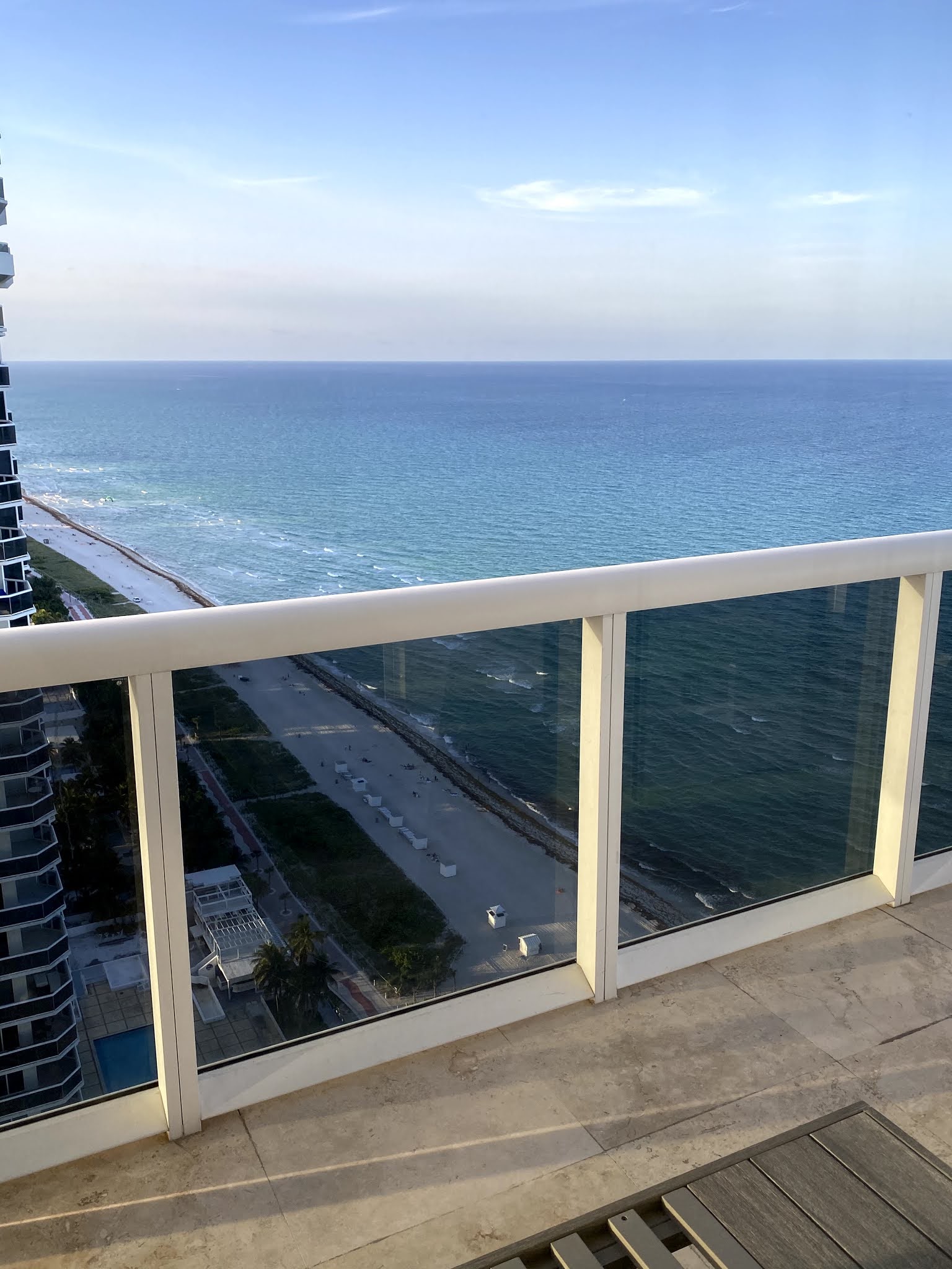
 Below are the different photos I have taken for my preliminary task cover page. 


Comments

Popular posts from this blog

Final Cover Page


Comparing Music Magazine House Styles

Since I plan on creating a magazine dedicated to music, today I will comparing a few music magazine covers and their house styles. I want to take note on any similar patterns that I may notice in different brands. This type of research is essential because I want to create something original, but also appeal to my audience effectively.  First, I did research on the Billboard magazine. I noticed their masthead is a thick, bolded, and rounded font with all lowercase letters. Also, there is not a definite color for the masthead, as it changes for every issue. In late 2019, their magazine issues had a vertical masthead, but they have now changed it to appear horizontally (like most magazines). Despite this change, most of their magazine covers tend to direct all of their focus towards the cover image.                                                 Next, I looked into...

Conventions

To learn more about the designing process of a magazine, I have done research on magazine conventions. They are features that compose a magazine (both the cover and the articles). Given that the front cover is what must appeal to people in order to get their attention, those are the conventions I will discuss in this post. Masthead: magazine's title which will usually be the larger text; the masthead is usually the first thing readers notice Tagline:  gives an idea of what the magazine focuses on Cover line: mention what is inside the magazine (may include attention grabbing names/topics that will attract audiences) Central image: a large image on the cover to appeal to people Cover model: person or people (usually in the central image) that will be included in the magazine Color scheme: the combination of different colors used in the magazine (including the font type/color) Barcode: placed in a spot where it does not take attention away from the other conventions (usually in one o...