After analyzing the features of a double-page spread to see what I liked and what I disliked, I have decided to look at several more examples to help me brainstorm.

The double-page spread above features the model, Nicki Minaj throughout both pages of the double-page spread though most of her body is on one of them. The image used is a mid-shot which brings more emphasis towards Nicki's accessories being displayed, and we can see her face in clearer detail. For the color scheme, various shades of pink are used along with black and white. Nicki Minaj, wears black and white, which matches with the font, and her pink lipstick stands out to coordinate with other parts of the font. I like the color coordination that was used because it makes everything more visually appealing, including the pink ombré background. I think there is too much small text which is not something I would want to reflect in my own double-page spread, but I like how they try to reduce it by dividing the texts.

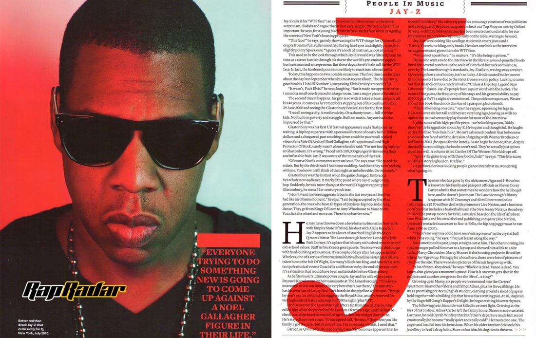
The double-page spread above features the model, Jay-Z on the entire left page with minimal text. The medium close-up brings emphasis to his serious facial expression and sunglasses that hide his eyes. This page includes a pull quote in red font which matches half of the background of Jay-Z's image. On the next page, the text is in black which matches Jay-Z's t-shirt and sunglasses. There is a large J displayed in red font with Jay-Z's name on this page, which also contributes to the color scheme. Compared to the last double-page spread, this one includes more text and conveys the artist in a more serious manner.
From both magazines I analyzed, I like the first one more. I learned about the effect of dividing text into more columns because it helps make the story more appealing, and people can feel more motivated to read it. If text seems to take up too much of the page, readers may stray away from reading it.
Comments
Post a Comment